Why Pizza Hut’s red roofs and McDonald’s play places have disappeared

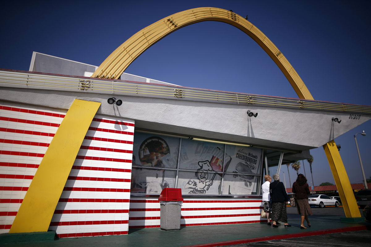
A historic 1950's McDonald's restaurant in Downey
By Nathaniel Meyersohn, CNN
For decades, bright, playful and oddly-shaped fast-food restaurants dotted the roadside along America’s highways.
You’d drive by Howard Johnson’s with its orange roofs and then pass Pizza Hut’s red-topped huts. A few more miles and there was the roadside White Castle with its turrets. Arby’s roof was shaped like a wagon and Denny’s resembled a boomerang. And then McDonald’s, with its neon golden arches towering above its restaurants.
These quirky designs were an early form of brand advertising, gimmicks meant to grab drivers’ attention and get them to stop in.
As fast-food chains spread across the US after World War II, new roadside restaurant brands needed to stand out. Television was new media not yet beamed into every single home, newspapers were still ascendant and social media unimaginable.
So restaurant chains turned to architecture as a key tool to promote their brand and help create their corporate identity.
But the fast-food architecture of today has lost its quirky charm and distinctive features. Shifts in the restaurant industry, advertising and technology have made fast-food exteriors bland and spiritless, critics say.
Goodbye bright colors and unusual shapes. Today, the design is minimal and sleek. Most fast-food restaurants are built to maximize efficiency, not catch motorists’ attention. Many are shaped like boxes, decorated with fake wooden paneling, imitation stone or brick exteriors, and flat roofs. One critic has called this trend “faux five-star restaurants” intended to make customers forget they are eating greasy fries and burgers.
The chains now sport nearly identical looks. Call it the gentrification of fast-food design.
“They’re soulless little boxes,” said Glen Coben, an architect who has designed boutique hotels, restaurants and stores. “They’re like Monopoly homes.”
Googie architecture
Fast-food restaurants developed and expanded in the mid-twentieth century with the explosion of car culture and the development of interstate highways.
Large companies came to dominate highway restaurants through a strategy known as “place-product-packaging” — the coordination of building design, decor, menu, service and pricing, according to John Jakle, the author of “Fast Food: Roadside Restaurants in the Automobile Age.”
Fast-food chains’ buildings were designed to catch the eye of potential customers driving by at high speeds and get them to slow down.
“The buildings had to be visually strong and bold,” said Alan Hess, an architecture critic and historian. “That included neon signs and the shape of the building.”
A leading example: McDonald’s design, with its two golden arches sloping over the roof of its restaurant, a style known as Googie.
Introduced in California in 1953, McDonald’s design was influenced by ultra-modern coffee shops and roadside stands of Southern California, then the heart of budding fast-food chains.
The two 25-foot bright yellow sheet-metal arches that rose through the McDonald’s buildings were tall enough to attract drivers amid the clutter of other roadside buildings, their neon trim gleaming day and night. McDonald’s design set off a wave of similar Googie-style architecture at fast-food chains nationwide.
Well into the 1970s, the designs were a prominent fixture of the American roadside, “imprinting the image of fast-food drive-in architecture in the popular consciousness,” Hess wrote in a journal article.
‘Visual pollution’
But there was a backlash to this aesthetic. As the environmental movement developed in the 1960s, opposition to the conspicuous Googie style grew. Critics called it “visual pollution.”
“Critics hated this populist, roadside commercial California architecture,” Hess said. Googie style fell out of fashion in the 1970s as fast-food style favored dark colors, brick and mansard roofs.
McDonald’s new prototype became a low-profile mansard roof and brick design with shingle texture. Its arches moved from atop the building to signposts and became McDonald’s corporate logo.
“McDonald’s and Jack in the Box unfurled their neon and Day Glo banners and architectural containers against the endless sky,” the New York Times said in 1978. They have been “toned down with the changing taste of the 60’s and 70’s.” And with the growth of mass communications advertising campaigns, brands no longer relied on architectural features to stand out –they could simply flood the television airwaves.
Fast-food goes upscale
In the 1980s and 1990s, companies began introducing children’s play areas and party rooms to draw families — additions to existing “brown” structures, Hess said.
The rise of mobile ordering and cost concerns since then altered modern fast-food design.
With fewer people sitting down for full meals at fast-food restaurants, companies didn’t need elaborate dining areas. So today they’re expanding drive-thru lanes, increasing the number of pickup windows and adding digital kiosks in stores.
“We have a lot of red-roof restaurants” that “clearly need to go away,” a Pizza Hut executive said in 2018 of its classic design. The company’s new prototype, “Hut Lanes,” helps to speed up wait times at drive-thru locations.
The new fast-food box designs with their flat roofs are more efficient to heat and cool than older structures, said John Gordon, a restaurant consultant. Kitchens have been reconfigured to speed up food preparation. They’re also cheaper to build, maintain and staff a smaller store.
But in the effort to modernize, some say fast-food design has became homogenized and lost its creative purpose.
“I don’t know if you’d be able to identify what they were if they had a different name on the front,” said Addison Del Mastro, an urbanist writer who documents the history of commercial landscapes. “There’s nothing to engage the wandering imagination.”
The-CNN-Wire
™ & © 2023 Cable News Network, Inc., a Warner Bros. Discovery Company. All rights reserved.